Interactive Animation Storytelling Site 2024
Static Sites Can’t Express Abstract Art
Designed a living, scrolling experience that awakens the senses.
Product & Motion Design
Wix Studio | figma


Keyframe from the interactive storytelling sequence inspired by my sketchbook visuals
Interactive Animation Storytelling Site 2024
Experss Myself In A Website
Product & Motion Design
Wix Studio | figma
Keyframe from the interactive storytelling sequence inspired by my sketchbook visuals

.png)

OVERVIEW
How it all began
On October 7, I initiated volunteer projects to support hundreds of thousands in need — victims, evacuees, reservists, and more.
I shared calls for help across multiple media platforms to recruit volunteers and collect donations for my organizations, Very quickly,
I received an overwhelming number of messages from people eager to help, but unsure how to get involved or contribute effectively.

Photos of me leading and participating in volunteer initiatives after October 7
OVERVIEW
When Technology Makes Art Speak
Static portfolios flatten creativity and silence abstract expression. Inspired by my sketchbook, I translated dots, textures, and freeform sketches into motion design. Through scrollytelling, these elements evolved into a living, breathing site - transforming a portfolio from a static gallery into a sensory storytelling experience.

Sketchbook-inspired graphic language
OVERVIEW
I Start With A Concept
TO tell the story from where its all been writen
Sketchbook-inspired graphic language
BACKGROUND
I was deeply moved by the sheer number of citizens eager to volunteer, yet struggling to find practical ways to help.
I was deeply moved by the sheer number of citizens eager to volunteer, yet struggling to find practical ways to help.
I began personally matching volunteers — based on their skills, interests, and availability — with the many civilian aid centers that sprang up immediately after the attacks. Seeing the powerful impact this had on both volunteers and people in need, I decided to create a social tech solution that would scale and automate what I was doing manually.

My sketchbook documenting the research and planning process
BACKGROUND
From Sketchbook to Digital Language
My sketchbook has always been my space for free exploration - dots, textures, and abstract compositions. For this project, I used it as the foundation of a digital visual language. Every hand-drawn element became the seed for animations, interactions, and motion patterns that later shaped the website.
.png)
Sketchbook planning pages mapping the site’s visual and storytelling flow.
THE social tech solution
I began personally matching volunteers — based on their skills, interests, and availability — with the many civilian aid centers that sprang up immediately after the attacks.
Seeing the powerful impact this had on both volunteers and people in need, I decided to create a social tech solution that would scale and automate what I was doing manually.

My sketchbook documenting the research and planning process
UX RESEARCH
Why Scrollytelling Outperforms Static Design
Research showed that nearly 85% of design portfolios are static, relying on heavy text and binary images.
Recruiters reported that 65% felt overloaded with text, 50% uninspiring, and only 20% truly engaging.
The few portfolios using motion and scrollytelling achieved higher engagement, stronger memorability, and a more authentic expression of design thinking.
.png)
Data on Scrollytelling Impact
.png)
Data analysis
I began by researching and analyzing data on volunteering trends and behaviors in the aftermath of October 7.
At this early stage, I focused on researching and analyzing data to understand the scale of the need and the opportunities for impact.

Graphs and data visualizations showing volunteer rates after October 7

UX RESEARCH
Identifying pain points and needs
I conducted interviews with volunteers, non-volunteers, and volunteer centers, using both open-ended and targeted questions to uncover their pain points and needs, ensuring the solution would be truly user-centered.

Graphs from user interviews, by sections volunteers, non-volunteers, and volunteer centers — showing what they want, feel, and need.
user interviews
Listening First. Always.
I spoke with volunteers, non-volunteers, and coordinators — asking what stops them, what drives them, and what they need. Their answers revealed real pain points — and real opportunities. These insights became the heart of the product.

Graphs from user interviews, by sections volunteers, non-volunteers, and volunteer centers — showing what they want, feel, and need.
Observing How Volunteers & Centers Actually Operate
I researched existing volunteer platforms to identify what was missing and where they fell short.
In addition, I observed volunteer centers and volunteers themselves to see firsthand how they currently manage sign-ups, how centers recruit, and how shifts are scheduled. This helped me pinpoint critical gaps and inefficiencies that my solution could address.

A table comparing existing platforms
Competitive Analysis
Seeing What’s Missing
I studied existing volunteer platforms — and watched how things really work on the ground. From chaotic shift scheduling to unclear onboarding, I found key gaps in both tools and workflows. These gaps became opportunities for smarter, user-centered design.
A table comparing existing platforms.
UX STRATEGY
Turning research into a strategy
I began synthesizing all my research findings to build an effective, user-centered solution for the crisis. This included developing end-to-end personas that represented key user segments, ensuring the product would address their real needs, motivations, and frustrations.
.png)
End-to-end personas and research synthesis.
.png)
UX STRATEGY
From Insights to Action
I translated research into strategy — building full personas that captured people’s needs, motivations, and blockers.
These weren’t just user types — they were real stories, shaping real solutions.
End-to-end personas and research synthesis.
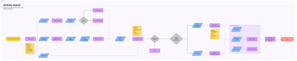
Information Architecture & Flow
Designing a Clear Path
I turned insights into structure — building an intuitive user flow and smart information architecture. Every screen, feature, and step was mapped to match user goals. The result?
A journey that feels simple, natural, and purposeful.
.png)
.png)
The architecture map and flow diagram.
UX STRATEGY
Turning research into a strategy
I began synthesizing all my research findings to build an effective, user-centered solution for the crisis. This included developing end-to-end personas that represented key user segments, ensuring the product would address their real needs, motivations, and frustrations.
End-to-end personas and research synthesis.
Solution Sketching
I translated all the research and strategy into visual concepts by sketching the solution.
This helped me explore the structure, interactions, and key features before moving to detailed design.
.png)
Low-fidelity wireframes.
UX Strategy
Designing Engagement Through Scrollytelling
Given that most recruiters spend less than three minutes on a portfolio, every interaction must create impact. Research confirmed that static, text-heavy portfolios fail to hold attention, while interactive experiences increase engagement by up to 50%. Based on these insights, I developed a scrollytelling strategy: transforming the user’s scroll into the driver of narrative flow. This approach ensures that the portfolio doesn’t just present projects — it performs them, blending abstract art with technology to awaken curiosity and the senses.

Scroll-triggered spotlight animation built with layered motion paths and timed easing.
VISUAL STORYTELLING INTRO
Introducing Myself Through Motion
Transitioning from research into creation, the first sequence invites the visitor to meet me - not through paragraphs, but through movement.
Spotlight effects, animated dots, and scroll-triggered interactions reveal: Hi, I’m Hen Gerson - nice to meet you.
This approach sets the tone: less words, more visual storytelling, letting creativity speak through the medium itself.
Scroll-triggered spotlight animation built with layered motion paths and timed easing.
INTERACTIVE JOURNEY
Turning Scrolling into Play
From introduction to interaction - each scroll triggers visual surprises, keeping the viewer curious and engaged. Dots expand, merge, and uncover hidden layers, creating a sense of discovery. The audience doesn’t just watch they participate. This transforms the experience from a passive portfolio into a playful, immersive journey.
.png)


Dot-based reveal sequence triggered by scroll position and viewport transitions.
VISUAL LANGUAGE
Conversing Through Design
The visual language acts like a live conversation. Words appear unexpectedly, synced with scroll timing, and paired with transitions that amplify meaning. Typography becomes a moving, expressive voice - turning each message into a moment the user experiences, not just reads.

Dynamic text reveal using mask animations and synchronized easing curves.
MAKING TECH FEEL UNIQUE
A Visual-Technical Performance
The light patterns, theatrical reveals, and modern motion frameworks push the boundaries of what a website can be.
It’s a staged performance inside the browser - merging technology, creativity, and storytelling .

Light-based animation layers rendered via blend modes and GSAP timeline orchestration.
✨ Case Study – Interactive Animation Portfolio Site
🟣 Hero
Headline: Static Sites Can’t Express Abstract Art
Sub-headline: Designed a living, scrolling experience that awakens the senses.
🔹 Overview
Headline: When Technology Makes Art Speak
Static portfolios flatten creativity and silence abstract expression. Inspired by my sketchbook, I translated hand-drawn dots, textures, and freeform sketches into motion design. Through scrollytelling, these elements evolved into a living, breathing site — transforming a portfolio from a static gallery into a sensory storytelling experience.
🔹 Background
Headline: From Sketchbook to Digital Language
My sketchbook has always been my space for free exploration — dots, textures, and abstract compositions. For this project, I used it as the foundation of a digital visual language. Every hand-drawn element became the seed for animations, interactions, and motion patterns that later shaped the website.
🔹 UX Research
Headline: Why Scrollytelling Outperforms Static Design
In my research, I reviewed hundreds of portfolio sites. Nearly 85% were static, relying on heavy text and flat images. Recruiters described them as uninspiring and repetitive: 65% overloaded with text, 50% uninspiring, and only 20% engaging.
By contrast, the few portfolios using motion and scrollytelling stood out — creating curiosity, stronger engagement, and lasting impressions.
📊 Visuals:
Pie Chart – Static vs Animated Portfolios
Bar Chart – Recruiter Feedback
Research Comparison (Comprehension, Engagement, Memory)
🔹 UX Strategy
Headline: Designing Engagement Through Scrollytelling
Given that most recruiters spend less than three minutes on a portfolio, every interaction must create impact. Research confirmed that static portfolios lose attention, while interactivity increases engagement by up to 50%.
Based on these insights, I developed a scrollytelling strategy: transforming the user’s scroll into the driver of narrative flow. This ensures the portfolio doesn’t just present projects — it performs them, blending abstract art with technology to awaken curiosity and the senses.
📊 Visuals:
Flow Diagram – User Scroll → Trigger → Animation → Emotional Response
🔹 Solution / Execution
Headline: Turning Strategy into Experience
The solution was to transform abstract sketches into an interactive language:
Visual Identity – dots, textures, and sketches became the foundation of the site’s design system.
Motion System – GSAP timelines orchestrated layered animations and scroll-triggered effects.
Interaction Design – each scroll event unlocked a new stage of the story.
Technology Blend – abstract art merged with modern web technologies to create a portfolio that performs, not just presents.
📊 Visuals:
Storyboard – Sketchbook → Animation → Live Site
Before/After – static vs animated
🔹 Process
Headline: From Research to Launch
The design process followed a structured path, balancing artistic exploration with UX principles:
Research – reviewed portfolio sites, recruiter feedback, and motion frameworks.
Concept Design – transformed sketchbook motifs into a digital language.
Prototyping – tested GSAP scroll-triggered animations.
Iteration – refined pacing, rhythm, and transitions.
Launch – deployed a living, interactive portfolio.
📊 Visuals:
Process Timeline Diagram
Wireframe vs Motion Mockups
🔹 Outcome & Reflection
Headline: Design That Performs
The project transformed a static portfolio into a living, interactive experience. Recruiters and peers described it as memorable, original, and immersive — a portfolio that doesn’t just show work but performs it.
It validated the insight that motion and storytelling create deeper engagement than static screens. More importantly, it taught me that design is not only about visuals, but about crafting experiences that awaken curiosity and emotion.
Technology can be poetic, not just functional — and interaction itself can become the language of design.
📊 Visuals:
Feedback Comparison Chart – Static vs Animated Portfolios
Screenshots / Motion Clips of final site
Pull Quote: “Most portfolios show; this one performs.”
Onboarding
Smart Onboarding with Purpose
The onboarding flow recognizes each user’s motivation and adapts in real time — guiding them to the opportunities that fit them best.
It’s not just registration. It’s connection, from the first screen.
.png)
Personalized onboarding
App Screens & Prototype
Fast. Familiar. Focused.
The UI feels like a familiar OS — so users know exactly what to do. Every screen flows naturally, collecting the right info at the right time through pop-ups, forms, and prompts. It’s smooth, efficient, and built for action.
.png)
Admin Dashboard
Built for Centers, Too
I designed the desktop dashboard for volunteer centers — with clear flows, smart pop-ups, and intuitive forms. Each feature encourages repeat use and smooth coordination — so volunteering becomes easier, faster, and scalable.

BACKGROUND
I was deeply moved by the sheer number of citizens eager to volunteer, yet struggling to find practical ways to help.
I was deeply moved by the sheer number of citizens eager to volunteer, yet struggling to find practical ways to help.
I began personally matching volunteers — based on their skills, interests, and availability — with the many civilian aid centers that sprang up immediately after the attacks. Seeing the powerful impact this had on both volunteers and people in need, I decided to create a social tech solution that would scale and automate what I was doing manually.
My sketchbook documenting the research and planning process

.png)
I was deeply moved by the sheer number of citizens eager to volunteer, yet struggling to find practical ways to help.
I was deeply moved by the sheer number of citizens eager to volunteer, yet struggling to find practical ways to help.
I began personally matching volunteers — based on their skills, interests, and availability — with the many civilian aid centers that sprang up immediately after the attacks. Seeing the powerful impact this had on both volunteers and people in need, I decided to create a social tech solution that would scale and automate what I was doing manually.
My sketchbook documenting the research and planning process
I was deeply moved by the sheer number of citizens eager to volunteer, yet struggling to find practical ways to help.
I was deeply moved by the sheer number of citizens eager to volunteer, yet struggling to find practical ways to help.
I began personally matching volunteers — based on their skills, interests, and availability — with the many civilian aid centers that sprang up immediately after the attacks. Seeing the powerful impact this had on both volunteers and people in need, I decided to create a social tech solution that would scale and automate what I was doing manually.
My sketchbook documenting the research and planning process
I was deeply moved by the sheer number of citizens eager to volunteer, yet struggling to find practical ways to help.
I was deeply moved by the sheer number of citizens eager to volunteer, yet struggling to find practical ways to help.
I began personally matching volunteers — based on their skills, interests, and availability — with the many civilian aid centers that sprang up immediately after the attacks. Seeing the powerful impact this had on both volunteers and people in need, I decided to create a social tech solution that would scale and automate what I was doing manually.
My sketchbook documenting the research and planning process

I began by researching and analyzing data on volunteering trends and behaviors in the aftermath of October 7.
At this early stage, I focused on researching and analyzing data to understand the scale of the need and the opportunities for impact.
Graphs and data visualizations showing volunteer rates after October 7
Identifying pain points and needs
I conducted interviews with volunteers, non-volunteers, and volunteer centers, using both open-ended and targeted questions to uncover their pain points and needs, ensuring the solution would be truly user-centered.

Graphs from user interviews, by sections volunteers, non-volunteers, and volunteer centers — showing what they want, feel, and need.

Identifying pain points and needs
I conducted interviews with volunteers, non-volunteers, and volunteer centers, using both open-ended and targeted questions to uncover their pain points and needs, ensuring the solution would be truly user-centered.
Graphs from user interviews, by sections volunteers, non-volunteers, and volunteer centers — showing what they want, feel, and need.